views
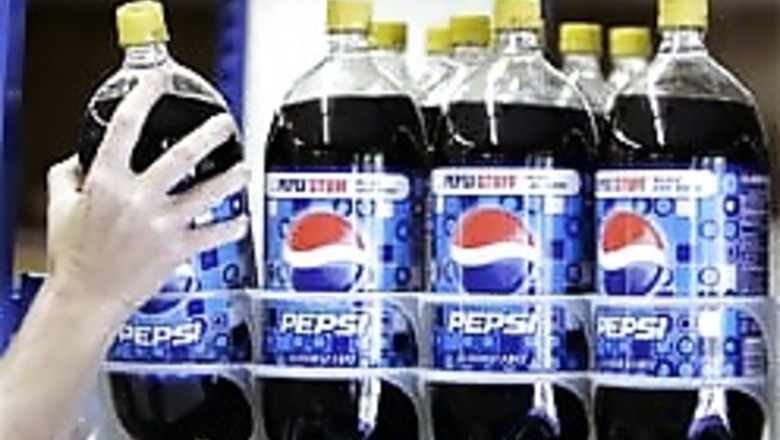
New York: With chief executive Indra Nooyi trying to redefine Pepsi as a "cultural leader", the soft drinks giant has revamped its ubiquitous logo, in circulation since 1987, by tilting up the white band in between the red and blue to form a circle with a smile.
The new logo, which took five months to finalise, follows Nooyi and PepsiCo Americas Beverages CEO Massimo d'Amore calling for a "quantum leap" forward in transforming the soft-drink category and defining Pepsi as a cultural leader, Advertising Age magazine said quoting Pepsi's vice-president (portfolio brands) Frank Cooper.
"We felt like, as we move out of this traditional mass marketing and mass distribution era into today's culture, there's an opportunity to bring humanity back, both in terms of the design but also in the way we engage consumers," Cooper told the New York-based weekly magazine of the advertising industry.
"By making the logo more dynamic and more alive ... (it is) absolutely a huge step in the right direction," he said.
When launched sometime next year, it is estimated to cost PepsiCo close to $1 billion to remove the old logo everywhere it appears - trucks, vending machines, stadium signage, point-of-sale materials and more around the world - and putting new material up.
The smile in the middle of Pepsi's circle will characterise brand Pepsi, while a grin is used for Diet Pepsi and a laugh for Pepsi Max, the Age reported in its Oct 27 issue. The type font used for Pepsi is also more delicate and playful, all in lower case, compared to the solid, all capitals font used so far.
The new logo is Pepsi's 11th in its 110-year history.
While some bloggers have pointed out new Pepsi logo's similarity to presidential candidate Barack Obama's circular logo looking like a sun with bands at the bottom, brand experts are split on the wisdom of Pepsi changing its logo.
"It's tilting the whole brand presentation from a classic expression of uniqueness and quality into something that is much more humorous, almost flippant," Tony Spaeth, an identity consultant, told Advertising Age.
"It worries me that it is less durable, less permanent and classic. It comes across as more of a campaign idea than an enduring brand expression," he said.
Disagreeing, Chris Campbell, executive creative director at Interbrand, said: "This seems to be a really good solution. It feels like the same Pepsi we know and love, but it's more adventurous, more youthful, with a bit more personality to it."





Comments
0 comment