views
Making a Pie Chart on the Computer

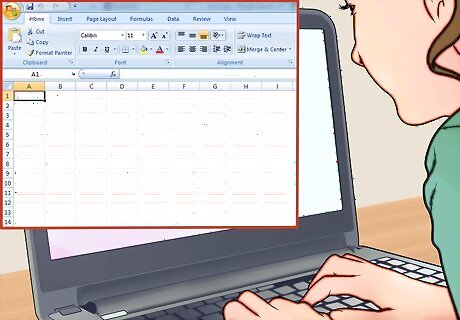
Open Excel. One of the easiest ways to create a pie chart is to use a program like Excel, which has a pie chart builder option. You should open a new worksheet in Excel and then enter in the data you would like to put into the pie chart.

Enter your categories and the data for each category. Start by typing in the categories that you want to compare in the pie chart in the first row of the worksheet. For example, you may be comparing the number of men, women, and children who lived in your town during 2012. So you would type in the following three categories in the first row of the worksheet: Men, Women, Children. Enter the year that applies to the data in the first box, cell A1. In this example, you would enter the year 2012. Enter in the applicable data for each category. For example, under Men, you may type in 2,200. Under women, you may type, 2,100. Continue to do this under you have put all of your data into the worksheet.

Select the data in the worksheet. Use your mouse to select all the data in the worksheet. The filled in rows should be highlighted blue.

Open the pie chart option under the Insert tab. There should be a pie icon that appears on the right of the toolbar, with a graphic in the shape of a pie chart. Click on the drop down arrow and choose the type of pie chart you would like to build. There will be a 2D option and a 3D option. You can decide if you’d like your pie chart to appear two dimensional or three dimensional.

Customize the design of your pie chart. You can also choose the design of the pie chart by going to the Design tab and selecting the chart layout you would like to use. You can decide which colors appear on your pie chart, as well as the overall the appearance of the pie chart.

Confirm the pie chart data is correct. Once the pie chart has been created in Excel, you should look over the pie chart to confirm all the data has been entered into the pie chart correctly. You can also highlight a certain section of the pie by clicking on it with your mouse. The slice should move slightly up and away from the rest of the pie chart.
Making a Pie Chart by Hand

Enter your data into a table. Start by organizing your data so it is divided into categories, with the applicable data noted for each category. You can do this by drawing out a simple table and entering in data by hand. For example, maybe you took a survey of your friends to find out which animals are the most popular pets in your friend group. You may have the following four categories in your table: Rabbits, Cats, Dogs, Birds. Then, you may enter the following data underneath each category: Rabbits, 4, Cats, 6, Dogs, 8, Birds, 2. Add up the values to get a total number of participants. In this case, it is 4+6+8+2 = 20.

Convert the data into percentages. The percentages are essential to creating the pie chart, as this will help you determine how big of a slice each category is going to take in the pie. To determine the percentages, you will need to divide each value by the total amount of participants and then multiply this value by 100. For example, if 4 people say they like rabbits, then you would divide 4 by 20 to get 0.2. Then, multiply 0.2 by 100 to get 20. This means 20% of the participants said they prefer rabbits as pets. You can do this with the rest of the values. For cats, divide 6 by 20 and multiply by 100 to get 30%, for dogs, divide 8 by 20 and multiply by 100 to get 40%, and for birds, divide 2 by 20 and multiply by 100 to get 20%.

Determine the sectors of the pie chart. A pie, or a circle, has 360 degrees. So you will need to take the values for each category and multiply them by 360 to determine how they fit into the full circle, or pie chart. This will give you the sectors of the pie chart. For example, to convert the values on rabbits, you would divide 4 by 20 to get 0.2 and then multiply 0.2 by 360 to get 72 degrees. For cats, you would divide 6 by 20 to get 0.3 and then multiply 0.3 by 360 to get 108 degrees.

Use a protractor to draw a circle. Place the protractor in the middle of a clean, white sheet of paper. Draw a perfect, round circle with a pen or pencil.

Divide each section of the pie chart. Use the protractor to measure the degrees of each sector. Mark each sector with a pen or pencil as you measure out each sector until the entire circle contains all the values. You should label each section with the appropriate category and color each section a different color with colored pencils or a marker. You should also include the percentage associated with the category. For example, the category on rabbits should take up 72 degrees of the circle, be labeled “Rabbits” and have the percentage 20% written down in that category. You may include a legend under the pie chart with the applicable colors and categories if you would prefer not to label the sectors right on the pie chart itself.

Title the pie chart. Once you finish labeling and coloring each sector of the pie chart, you should add the overall title of the pie chart at the top of the chart. For example, you may title your chart about favorite pets as “Favorite Pets According to My Friends”.
Understanding the Purpose of a Pie Chart

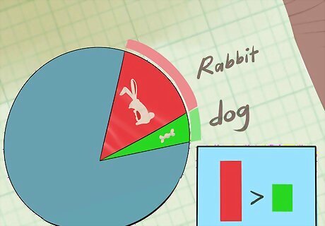
Use a pie chart to compare parts to a whole. A pie chart is useful for dividing data into distinct categories, or looking at the parts of a larger whole. You can use a pie chart to compare as small as two categories and as large as seven categories. You should also use a circle graph if there is a significant amount of difference in your data. For example, 10 people who prefer rabbits and only 2 people who prefer dogs. If you are trying to show changes or shifts in a category over a long period of time, for example, year to year, you will need to create multiple pie charts, one for each year.

Put nominal data or ordinal data in a pie chart. Nominal data is data that can be categorized by descriptive or qualitative information. It is data that can be named, or made nominal. For example, a country of birth or a type of pet would be nominal data. Ordinal data is data that is set in a specific order. It can also be named and easily categorized but it is ranked, from lowest to highest, or from biggest to smallest, etc. For example, the hottest time of the year or the most popular movie genre would be ordinal data.

Make data easy to read and present by putting it in a pie chart. Pie charts are often used as tools in presentations or talks, especially for a large crowd. Pie charts are great visual tools and can allow you to present data in a way that is easy to understand and comprehend. Often, pie charts are used to demonstrate distinctions between groups or preferences between different individuals.


Comments
0 comment