views
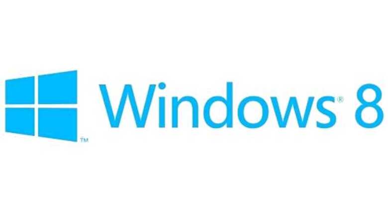
San Francisco: Microsoft announced that it was redesigning the logo of Windows software, making a fundamental change to the iconic four-colour Windows logo users have been used to for 20 years.
Meshing with the Metro design of Microsoft's upcoming Windows 8, the new logo is a slightly-angled blue block with a thin white cross in the middle, making it look like a window instead of the four-colour wavy flag in the past, reported Xinhua.
"The Windows logo is a strong and widely recognised mark but when we stepped back and analysed it, we realised an evolution of our logo would better reflect our Metro style design principles and we also felt there was an opportunity to reconnect with some of the powerful characteristics of previous incarnations," said Microsoft in a blog post.
"We did less of a re-design and more to return it to its original meaning and bringing Windows back to its roots - reimagining the Windows logo as just that - a window," the company said.
The new logo is designed by Paula Scher from the Pentagram Design Agency, whose notable works include the Citibank logo.
The first Windows logo debuted in November 1985. Since then, the logo has gone through several redesigns, which were all based on the design of a four-color wavy flag.


Comments
0 comment