views
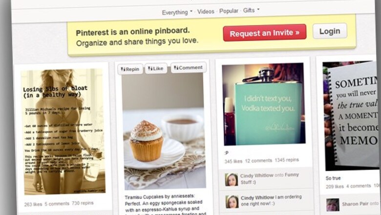
New York: Don't worry, Pinterest fans: Your sprawling virtual pegboards of wedding dresses, handmade jewellery, craft projects and food porn haven't changed dramatically. They're just easier to manage.
The popular link- and photo-sharing website has rolled out an update, one offering people simpler navigation and new ways to arrange their boards to fit their needs. Although the haphazard spirit of Pinterest remains, the site is much less overwhelming.
I wasn't a Pinterest user before, so the redesign gave me a chance to take a good look at the site for the first time. Before that, I had refused to be sucked into yet another form of social media. I figured I didn't have much use for it.
In the months since I started testing out Pinterest's new look, though, I've found the service helpful in organizing and sharing my continually expanding recipe collection. And it's fun to check what other people around the world are looking at and to see which strangers choose to follow me or respond to what I'm sharing.
Although it is not a replacement for Facebook or Twitter, and doesn't pretend to be, it is a beautiful and vast world with more than 25 million users around the world.
For those who have never used Pinterest, the free site lets people "pin" pictures from websites they want to share on online peg boards. You can choose to share the boards with just a few close friends or the entire Pinterest world. Others can comment on the boards and pins, "like" them or repin items on their own boards.
The result is an eclectic mix of millions of boards spanning just about as many topics. Although it doesn't offer as much of a chance to communicate and debate the way Facebook and Twitter do, Pinterest is an interesting and often beautiful supplement to those social media networks.
Pinterest's recent redesign is intended to cut down on clutter and make the site easier to manage, without drastically changing its look. The new look continues to evolve. Most of the changes are very subtle, and some have been tweaked or reversed already, helping Pinterest avoid the kind of backlash that Facebook has weathered in the past. Pinterest promises even more updates in the weeks and months ahead.
One of the most noticeable changes so far is Pinterest's move to larger pins, so you get four rather than five items per row. The site looks cleaner and less overwhelming because you don't see as many items on the screen at once. Much of the text previously found on Pinterest boards is smaller or gone. Menus have been streamlined.
What impresses me most about Pinterest - and also what drove me crazy - is its vast variety. Although there's no shortage of boards devoted to food, clothing, gadgets and home decor, there are also ones devoted to obscure topics such as doors, hockey goalies and the character Daryl from the TV show "The Walking Dead."
Some boards are very artistic and personal, while others, like mine, are more practical than pretty. The possibilities are endless, and so is the potential for wasting time - another reason I held off on joining for so long. Basically, whatever you're obsessed with, there's something on Pinterest for you.
For me, that's food.
I have hundreds of food-related sites bookmarked on my work and home computers, plus my iPhone and my iPad. They cover healthy recipes geared toward using up ingredients from my weekly farm share, tips for cooking a filet mignon and lists of New York restaurants with the best ramen and pizza. Other people have shared everything from the most ornate wedding cakes to those old-fashioned casseroles held together with canned soup.
Pinterest became a handy way to organize all that. First, I set up a Pinterest board simply titled "Recipes." That quickly spawned separate boards for easy meals, desserts and New York City restaurants. Although they pale in size so far to many of the countless other recipe boards out there, I find myself adding a couple things every day as I browse Twitter, Facebook and, of course, other Pinterest boards.
The boards also serve as a handy way for me to share recipes. Want my go-to red velvet cake, mac and cheese and turkey chili recipes? They're all on my Pinterest page. It also gives me easy access to my recipes when I need them. Rather than emailing myself links to recipes that I've bookmarked on my office computer, I can just pin them to my board and open up it later on my iPhone as I walk through the grocery store or on my iPad as I stir something on the stove.
After just a few months, some of my boards have grown pretty large. The new, less cluttered version of Pinterest helps me find what a need a little faster.
The activity feed, which details who likes and repins your pins along with other information, is in the process of moving to a drop-down menu on the right-hand side, clearing more space for the pins and their often beautiful photos. Its content is expanding as well. Notifications go back further in time than what users previously saw.
Filtering boards and pins by topic, such as "Art," "Food & Drink" and "Geek," is now easier, too. Instead of one long list dropping down from the middle of your page, the categories fall from the upper left in three shorter columns. It's a simple change that makes the list less daunting to read through. Meanwhile, all of the profile and account settings have been consolidated in a dropdown menu on the right.
A plethora of new information also pops up now when you take a close-up look at a pin. To the right of the pin is a mini version of the board it came from, which you can scroll through. There is a mini board showing other pins from the same website, so you can discover related recipes, for instance. Below all of that is a collection of pins from people who pinned the pin you're looking at. It's a way to discover material from like-minded people. It's a lot of content on one page, but surprisingly manageable.
Pinterest has also boosted its search capabilities, so that when you start typing something in the search box located in the upper-left corner of the page, a list of suggested words appears below it. That's helpful if you don't know exactly how to spell something.
But some popular features have also been eliminated. Gone is the site's "originally pinned by" feature, which showed which user was the first to pin a certain item. But Pinterest notes that many users have requested its return. I wouldn't be surprised if it did. Based on user feedback, Pinterest has already brought back other features, including one that allows users who have just pinned something to look at related pins or go straight to their pin by clicking on its "see it now" button.
What makes Pinterest different from other social media services is that it's not so much about posting your opinions or even letting your friends know about what's going on in your life. Instead of creating new content, it's about sharing and organising what's already out there, preferably content that's attached to cool photos.
You get a beautiful visual experience and links to just about everything online right now.
If that's something you're interested in, you might want to give the new and improved version a shot. Just don't spend too much time at the office looking at recipes for 1950s-style casseroles made with cream-of-whatever soup. It's 2013, after all.









Comments
0 comment