views
X
Trustworthy Source
Johns Hopkins Medicine
Official resource database of the world-leading Johns Hopkins Hospital
Go to source
With a little practice, you’ll be able to read an audiogram.
Understanding the Parts of the Audiogram
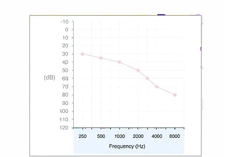
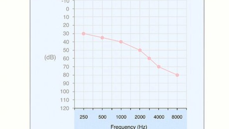
Find the frequency plotted along the bottom of the graph. The horizontal axis of the graph will show you the frequencies that were used in your test, measured in Hertz. Each line in the graph will correspond to its own frequency, which will allow you to see how well you heard that frequency. They start low and move higher on the spectrum. Frequencies commonly range from 250 Hz up to 8000 Hz. Lower numbers represent lower pitched sounds, while higher numbers mean higher pitched sounds.
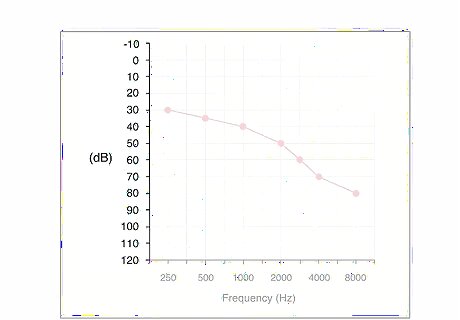
Locate the intensity along the side of the graph. The vertical axis will show you the intensity of the sounds that you heard, measured in decibels. Each horizontal line will correspond with an intensity rate. This is the volume of the sounds. When you were given your hearing test, it started at the lowest intensity rate and stopped when you indicated that you could hear the sound. Intensity commonly ranges from -10 dB up to 120 dB.
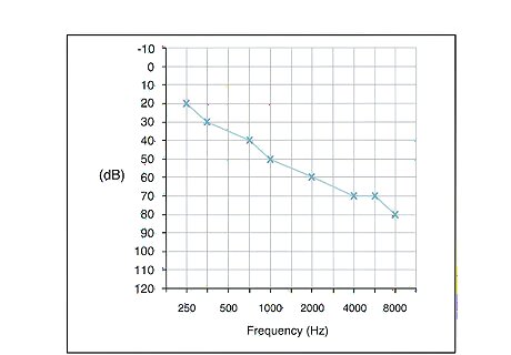
Look for an “X” or a square. Your left ear will be represented by either an “X” or a square depending on which icon the company who administered your test chooses to use. You will see the “X” or square on one of the plotted lines inside the graph. The line for your left ear is also usually blue. If you wore earphones during your test, you should only see two lines, one for your right ear and one for your left.
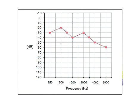
Find the circle or triangle. This will represent your right ear. Like with your left, the symbol used will depend on the company that administered your test. You will see the circle or triangle on a plotted line inside your graph. The right ear line is usually red. Most audiograms depict just the right and left ears. If you find one line, you’ll know by process of elimination that the second line must represent the other ear.
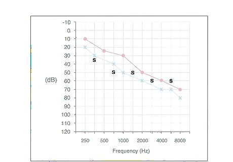
Look for an “S” if you didn’t wear headphones. Most hearing tests will include earphones that produce two results - one for each ear. However, you may also be asked to hear sounds from a speaker. If this happens, you will see an “S” line, which tells you how well you heard those sounds. Results from the speaker test represent how well your stronger ear can hear.
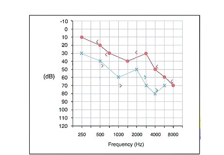
Search for arrows ("<" or ">") if you had bone conduction testing. If a bone conduction test is included in your audiometric testing, then different symbols will be used. Your right ear will be represented by the "<" symbol, while your left is represented by the ">" symbol. Bone conduction testing could also be shown with brackets, such as [ for you right ear and ] for your left ear. This test is used to determine what is causing your hearing loss, such as damaged nerves or something like earwax blocking the sound waves. Most audiograms will not contain these symbols.
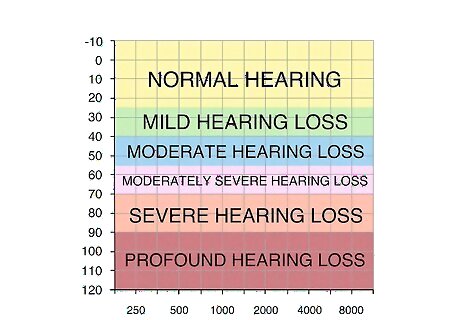
Recognize the hearing thresholds. Your audiogram should have shading to indicate the five different thresholds for hearing. Each threshold includes a range of intensity readings. The thresholds range from normal up to profound hearing loss. This allows you to see how well you can hear compared to someone in the normal range. Normal hearing ranges between 0 to 25 dB. Mild hearing loss ranges between 25 to 40 dB. Moderate hearing loss ranges between 40 to 55 dB. Moderate to severe hearing loss ranges between 55 to 70 dB. Severe hearing loss ranges between 70 to 90 dB. Profound hearing loss requires an intensity above 90 dB.
Deciphering Your Results
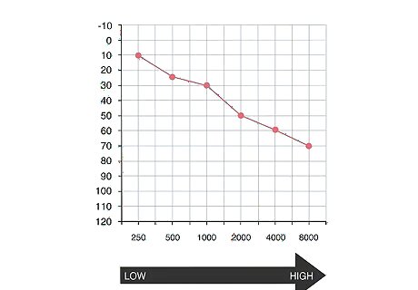
Work your way from left to right. The left side will show you the lower frequencies, which mean lower sounds. It’s best to start here because it will make reading the graph easier. Many people with hearing loss are better able to hear lower sounds, meaning that you will may have better results for those frequencies.
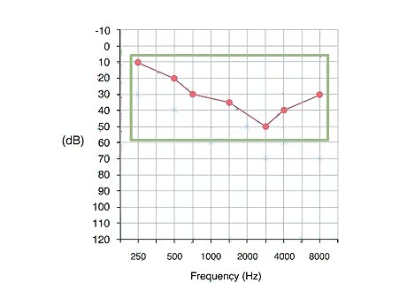
Focus on one ear at a time. It’s usually easiest to look at one set of results at a time, especially if you have different levels of hearing in each ear. It will make it easier for you to process the results if you are only looking at one line at a time. If they are very close together, however, you may want to look at them together.
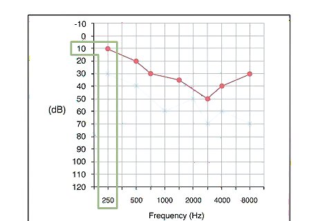
Look at the frequency first. Start with 250 Hz, which is the lowest frequency. Slide your finger up the chart until you reach the dot. Look to your left to see which intensity that the dot corresponds to. This will tell you the softest sound that you could hear at that frequency. For example, your 250 Hz dot might be plotted on the line that corresponds to the 15 dB intensity. This means that you could not hear that frequency when it was played at a lower volume than 15 dB. The higher the dB, the louder the sound had to be played before you heard it.
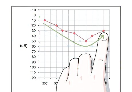
Find your results for each frequency. Repeat the process of finding the intensity for each frequency. To make it easier, follow the line connecting the plotted points for that ear. You should have plots for 250 Hz, 500 Hz, 1000 Hz, 2000 Hz, 4000 Hz, and 8000 Hz.
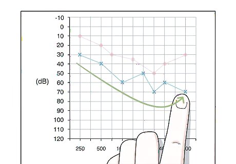
Repeat the process for the other ear. Start back at the lowest frequency and follow the plotted line to find the softest intensity that you could hear each sound. If you have other results, such as the “S” speaker results or bone conduction testing results, you can read them in the same exact way. The only difference in the way the information is presented is the symbols.
Determining if You Have Hearing Loss
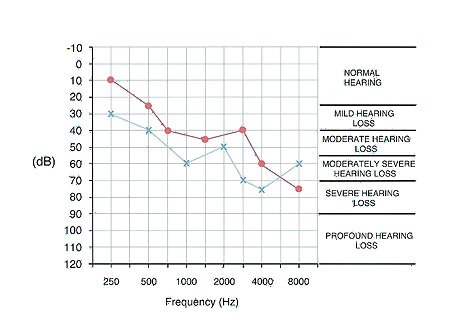
Find the threshold range where each frequency falls. Each plotted point will fall into one of the five thresholds. It’s possible that you could hear some frequencies in the lower range, while others require a volume that falls into one of the hearing loss ranges. If any of your plots fall into a “hearing loss” range, then you have some hearing loss.
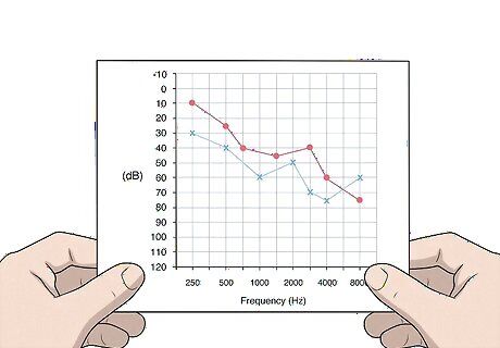
Look at the slope of the line for each ear. This will show you what type of hearing loss you have. All hearing loss is not the same. Some people will hear all of the frequencies in the same range of intensity, while others may show only partial hearing loss. While partial hearing loss sounds better, it can still be severe if you are unable to hear certain frequencies. A sharp slope indicates that how well you hear varies depending on the frequency of the sound. This makes it harder to say what type of hearing loss you have. You may hear lower frequencies at an intensity in the normal or mild hearing loss range, while high frequencies fall in the severe hearing loss range. This would mean you have partial hearing loss. A flatter line means that your hearing is consistent, making it easy to determine which threshold you fall into. You can look at the range of numbers where most of your plots fall, and this will tell you what type of hearing loss you have. For example, if the plots range between 45 and 60 dB, then you would have moderate hearing loss.

Follow up with your doctor. Your doctor can provide you with more information about what your results mean and what steps you need to take to make living with hearing loss - if you have any - easier. You may need to make lifestyle changes to prevent further hearing loss, and you may need accommodations like a hearing aid to help you hear better.


Comments
0 comment